Designed to be distinct and unconventional.

Art Direction
Brand Identity
Editing and Copywriting
Editorial Design
Naming and Strategy
Brief: Denison Yachting is a prominent super-yacht broker and builder based in Fort Lauderdale, USA. They sought to launch an offbeat luxury travel, lifestyle, maritime brand and magazine, to connect with potential clients, suppliers and customers at global super-yacht shows and events. The brief was to reference their yacht building heritage, which dates back to the 1930's, while highlighting their contemporary brokerage status, and stand out from the generic formula of traditional maritime publishing.
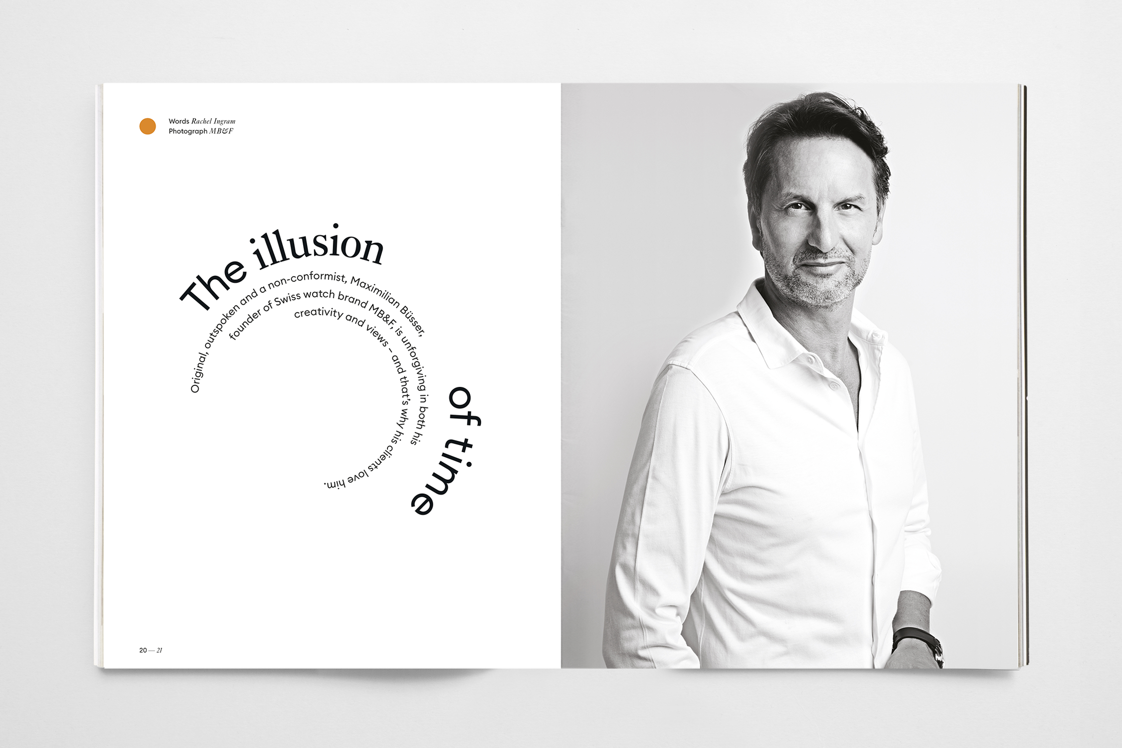
Strategy: We took inspiration from Frank Denison, the company founder, who became the namesake of the new brand, and the elegant typography used in yacht advertising from the 1930's. The brand identity playfully combines Ehrhardt, a serif typeface launched in 1938, with a contemporary sans serif typeface, customised for the project. to create a visually striking and modern look.
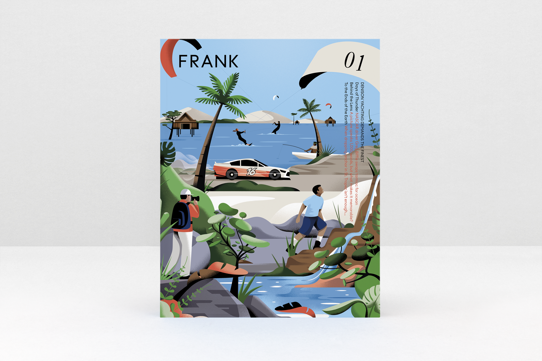
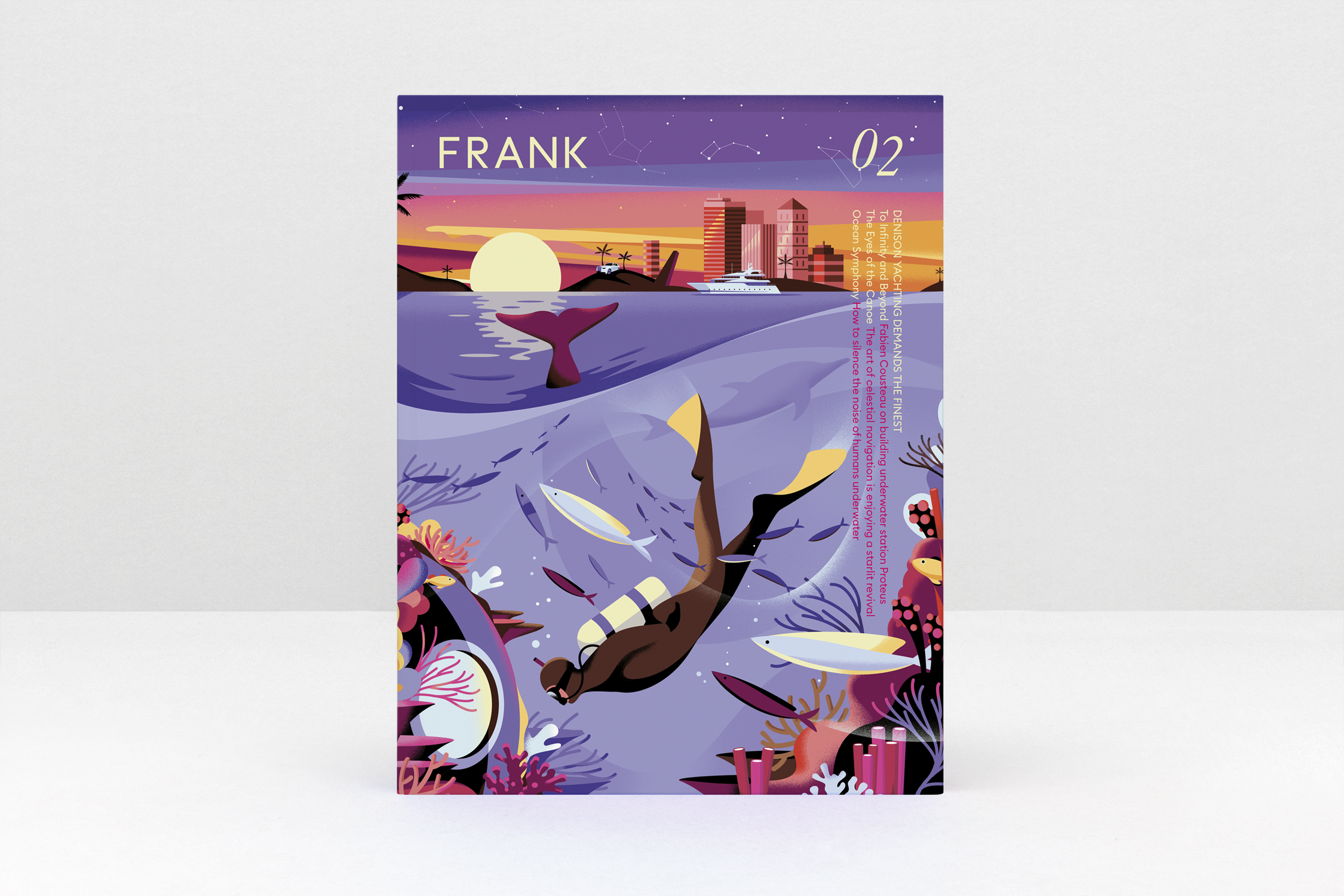
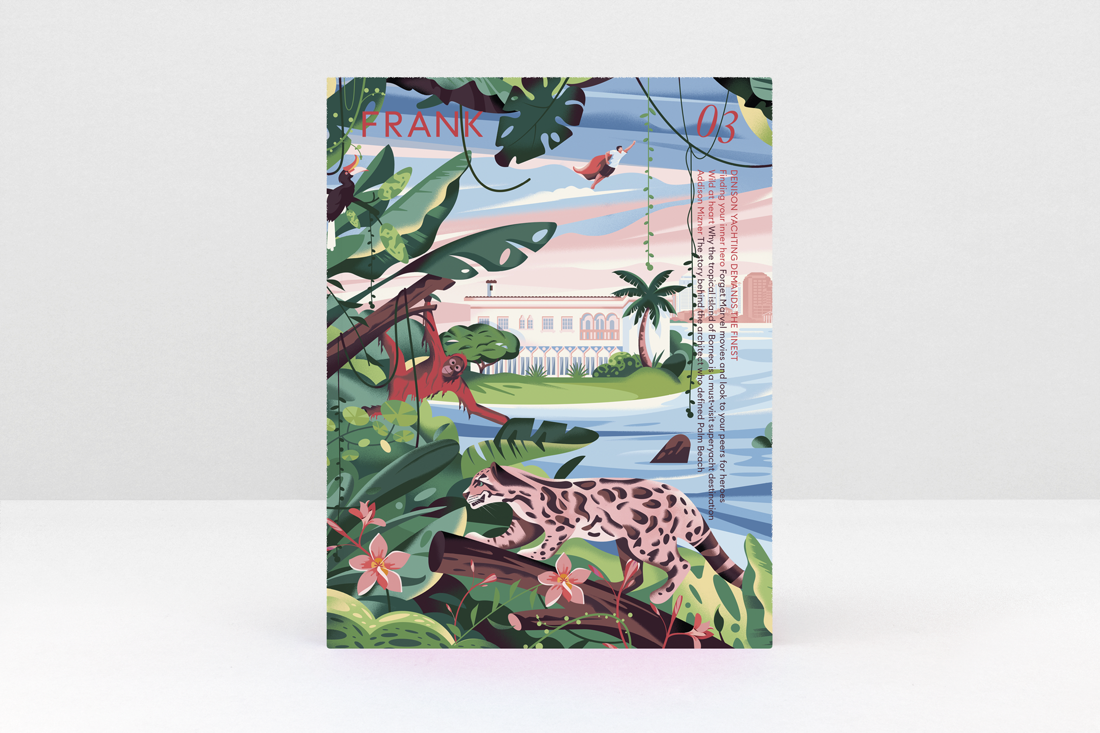
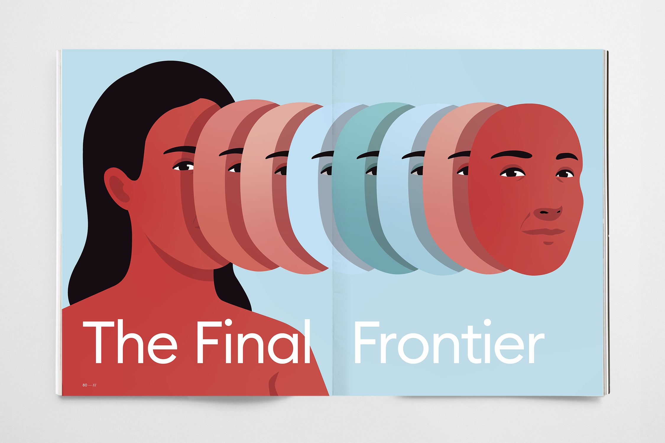
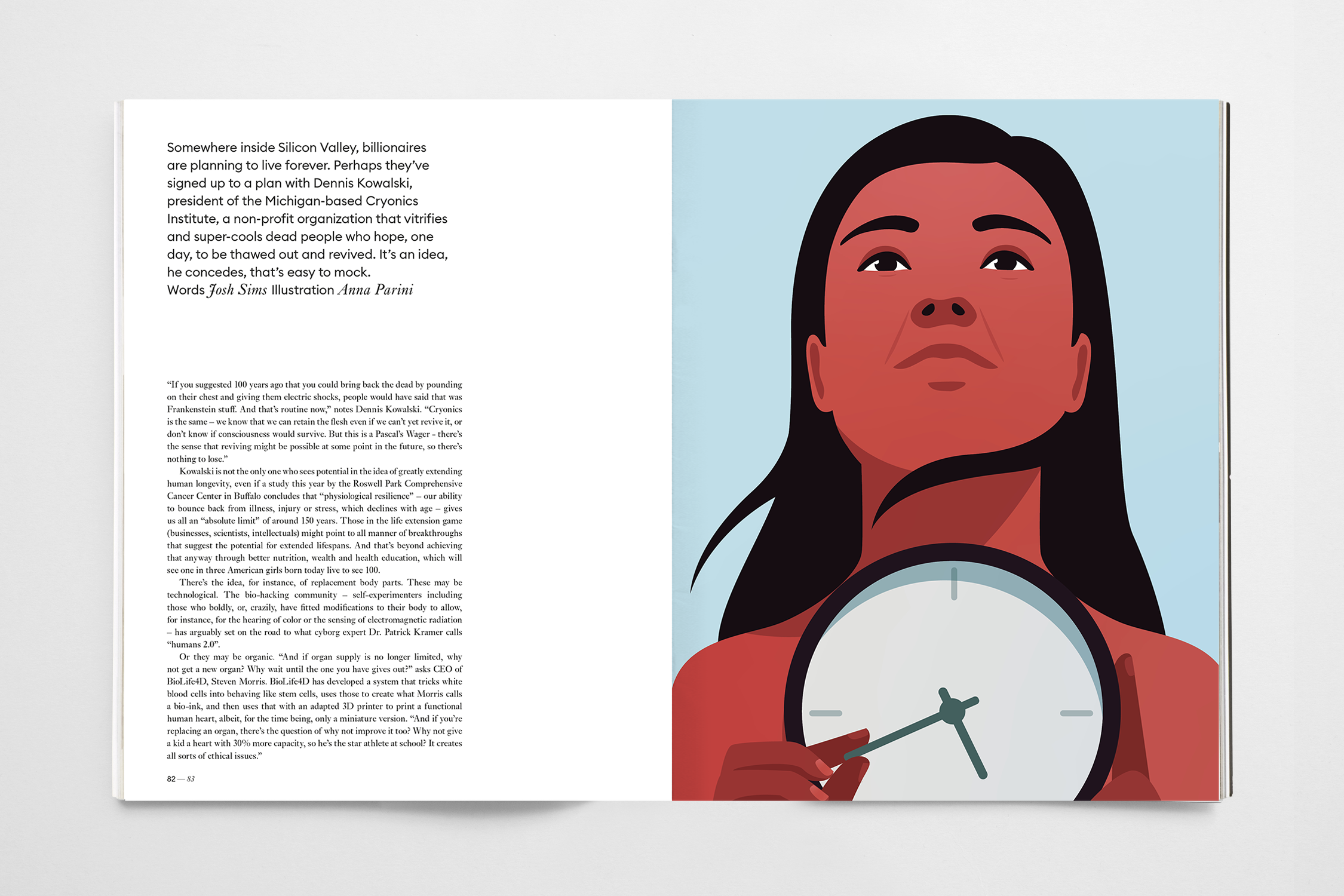
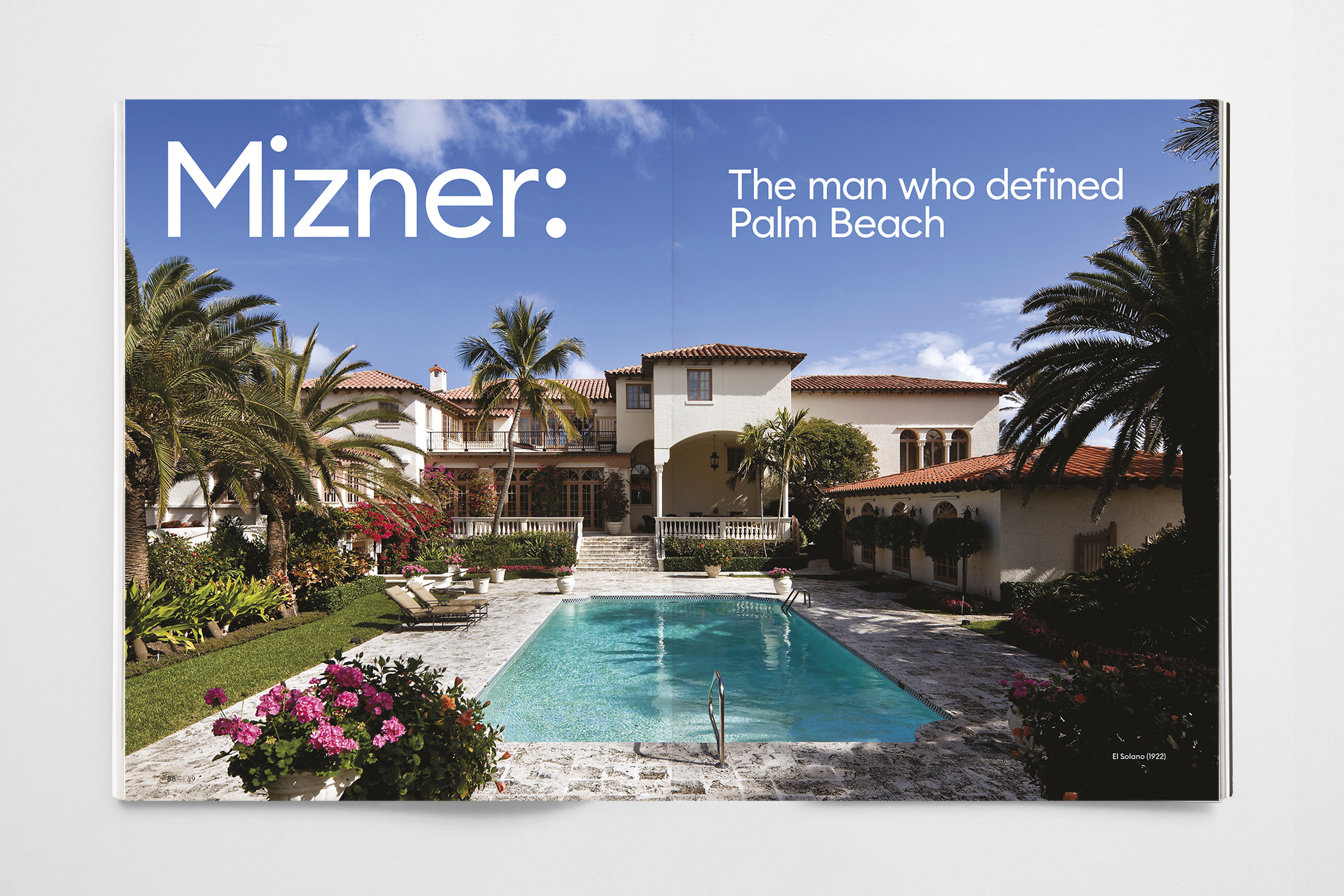
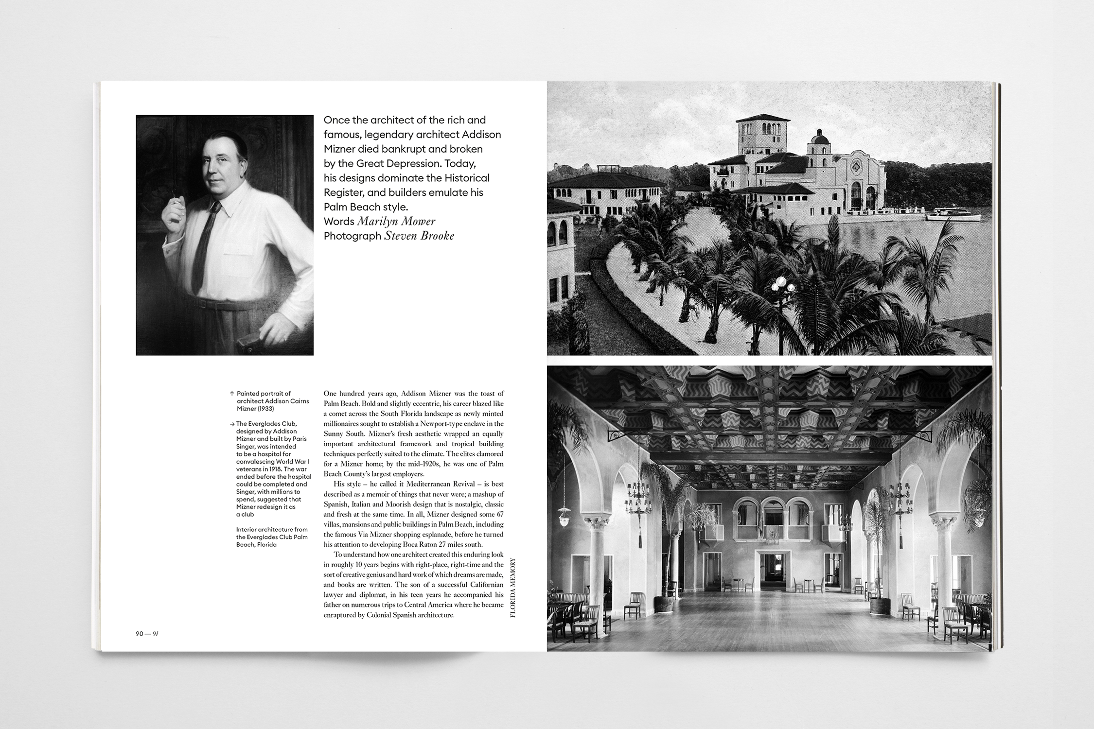
Delivery: The result is 'Frank' a new brand and publication that uncovers human interest stories. Each issue features specially commissioned cover illustration by Nathalie Lees, who was briefed to create a fictious composition visualising the three leading cover stories, to further enhancing its distinctive aesthetic.